AI Sandbox: Designing a Controlled Interface for LLM Experimentation
Designed and developed a web-based interface for safe, controlled experimentation with large language models for students and faculty.
Overview
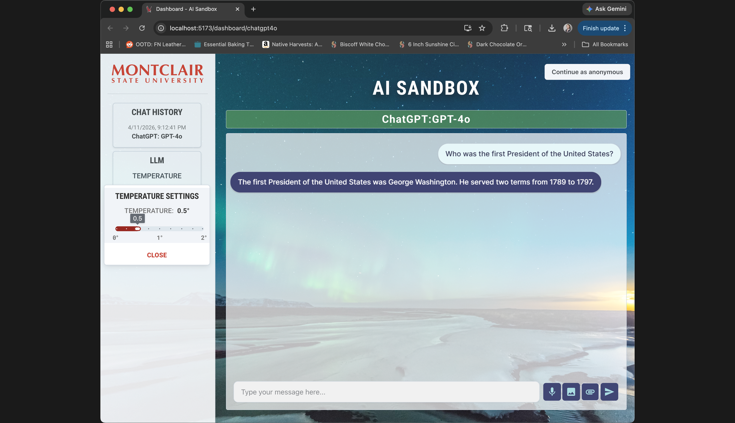
Most recent screenshot from April 11, 2026 of the AI sandbox Project, currently showing the ChatGPT-4o model being used
In 2024, our team at Montclair State University set out to build an AI sandbox — a controlled environment where students and faculty could experiment with large language models without exposing sensitive data to public model training.
The project was motivated in part by Harvard's AI Sandbox, which had launched a pilot the previous year and represented one of the few serious attempts to bring LLMs into academic settings responsibly.
The Initial Issue
The problem was that existing tools, including Harvard's, prioritized security architecture over usability. Harvard's sandbox is kept close to the chest — there's essentially one recorded demo video publicly available — but that was enough to identify real friction points. Low contrast, small typography, no visual distinction between what the user typed and what the model returned. For a tool aimed at students with varying levels of technical fluency, that's a significant barrier.
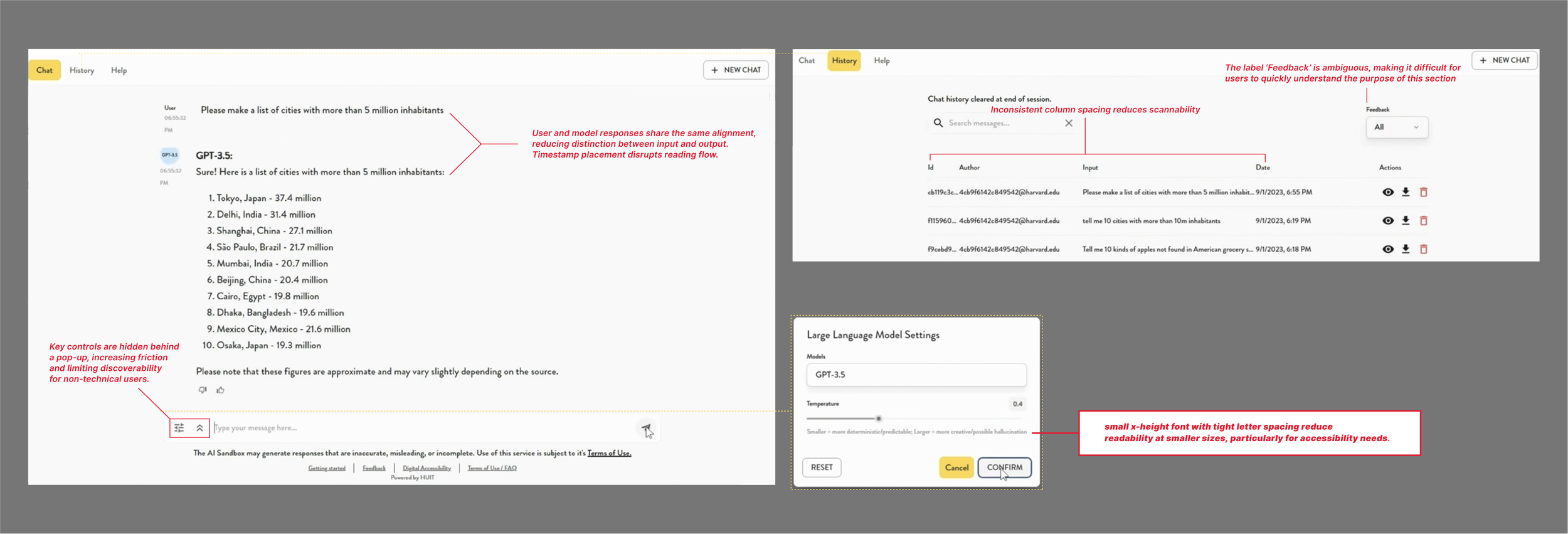
Annotations taken from the harvard demo website publically available on the web of their chatbox and the various UX issues that it presents
Our team consisted of a professor, an adjunct faculty member, and two students. I handled the frontend: interaction design, visual design, prototyping, and implementation, with some input into broader architecture decisions where they touched the user experience.
The Comparison that shaped the design
Without access to Harvard's codebase or documentation, I conducted an informal heuristic evaluation using the available demo footage — watching how the interface behaved, what controls were visible, how interactions were structured. This became the baseline I designed against.
A few things stood out. The existing interface used uniform styling throughout, making it hard to scan a conversation and quickly identify who said what. Controls were either hidden behind hover states or buried in submenus, which works fine for technical users but creates real friction for anyone less familiar with the conventions of chat-based AI tools. And several features that would help users understand what the model was actually doing — like temperature, which controls how predictable or varied the outputs are — were either absent or not surfaced in any meaningful way.
Our own paper actually listed temperature control as future work. I implemented it before that version shipped. That decision ended up being one of the more meaningful ones, not because it's technically complex, but because it turns an abstract concept into something you can feel. Move the slider, run the same prompt twice, see different outputs — that's a better explanation of model randomness than any documentation.
Design decisions
The first thing I tackled was visual separation between user input and model output. I introduced color-coded text areas — one for human turns, one for AI responses — which sounds minor but meaningfully reduces cognitive load when you're trying to skim back through a conversation or show a student what the model actually produced versus what they asked. Comparable tools used uniform styling throughout; we didn't.

A cropped image of the temperature setting menu and an image of the visual change in color when the microphone input is being utilized
I also made a deliberate choice to expose controls directly rather than hiding them. Every key input — model selection, temperature, function type — is visible from the start, labeled in plain English, and doesn't require discovering a submenu to access. This was specifically designed for users who aren't AI-native: faculty members trying the tool for the first time, students who've never interacted with an LLM outside of ChatGPT. The interface shouldn't require fluency to operate.
On the architecture side, I worked with the team to restructure the chat system into separate routes for each model. This reduced load when switching between models, made the codebase more maintainable, and gave us a clean place to add color-coded model identifiers on the client side — a small touch that made multi-model sessions easier to follow.
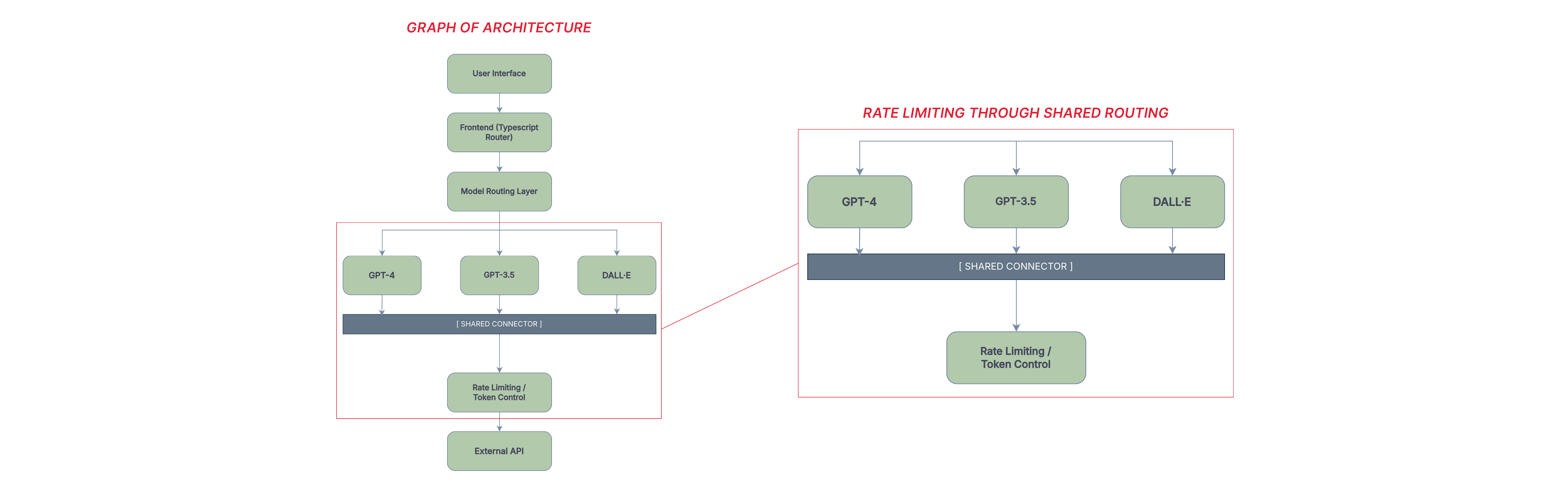
Two graphs showing parts of the UX infrastructure
Constraints
This was a research prototype, and the constraints shaped everything. Budget limited us to three OpenAI models. The system ran on a local laptop for most of its development life, which meant response times between two and thirty seconds depending on the task, and no real path to quantitative performance benchmarking.
Token limits and rate limiting were built in early to keep costs from spiraling. Security was implemented at a high level — appropriate for the project's scope, but not something I'd hold up as production-ready.
Designing within those limits meant making choices about what the interface could honestly promise. Error states were important: the system flags empty queries, unsupported file types, and failed model connections directly in the response area, rather than silently failing. If the tool couldn't do something, it said so, and why.
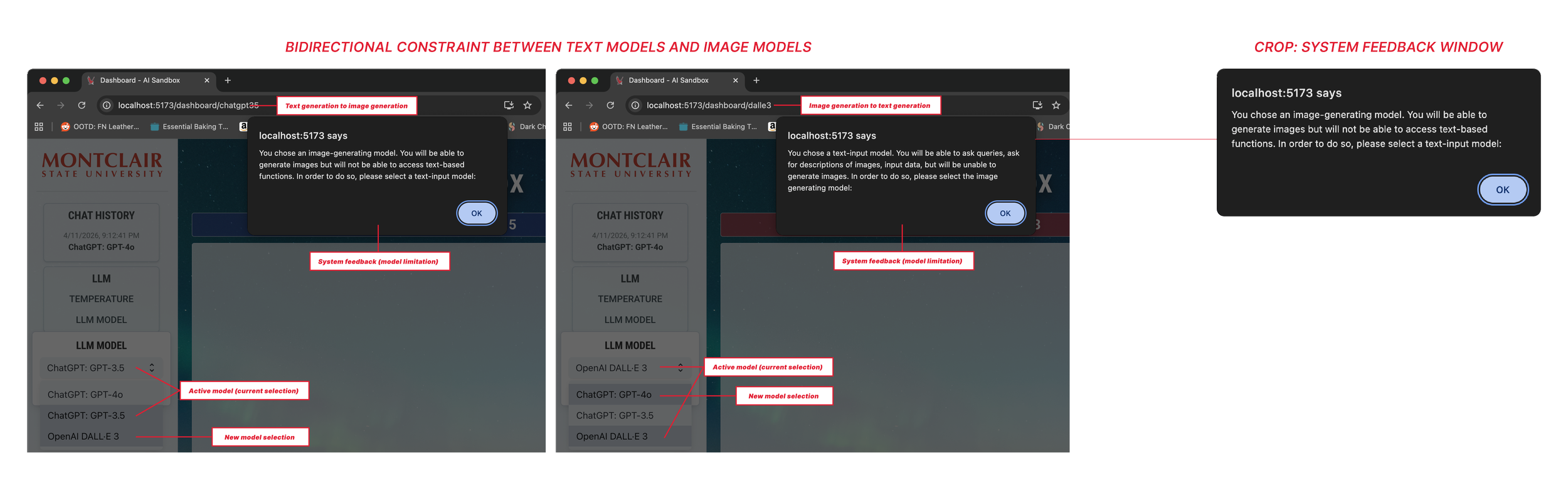
System displaying constraint when moving through different model output types
For users who are still building trust in AI systems generally, that transparency matters.
What I didn't get to do
The project lost funding before we could run structured user testing. That's a real gap in the story, and I want to name it directly: the design decisions I made were grounded in heuristic analysis and my own judgment about what non-technical users would need, but they weren't validated with actual users in any formal way. I observed people using the tool informally, gathered anecdotal feedback, and iterated — but that's not the same as a research protocol.
If the project had continued, I would have wanted to run task-based usability sessions with students across departments, specifically targeting people with no prior experience with LLMs. The temperature slider in particular was a hypothesis — that making the control visible would help users develop intuition for model behavior — and I'd want to test whether that actually happened, or whether it introduced confusion for users who didn't know what temperature meant in this context.
Outcome
The final system gave students and faculty a way to work with language models that felt legible and approachable. Non-technical users could navigate it without hand-holding. The design choices that prioritized visibility over cleverness turned out to be the right ones for this audience.
What this project reinforced for me is that interface design in constrained environments isn't just an aesthetic problem — it's about making a complex system's behavior readable to someone who didn't build it. An LLM is already something of a black box. The interface either adds to that opacity or works against it. That's the tension I was designing around the whole time.