
Mise en Plate
Designed and co-developed a responsive recipe organization platform for saving, filtering, and managing recipes across dietary needs, cuisines, proteins, and user-submitted tags.
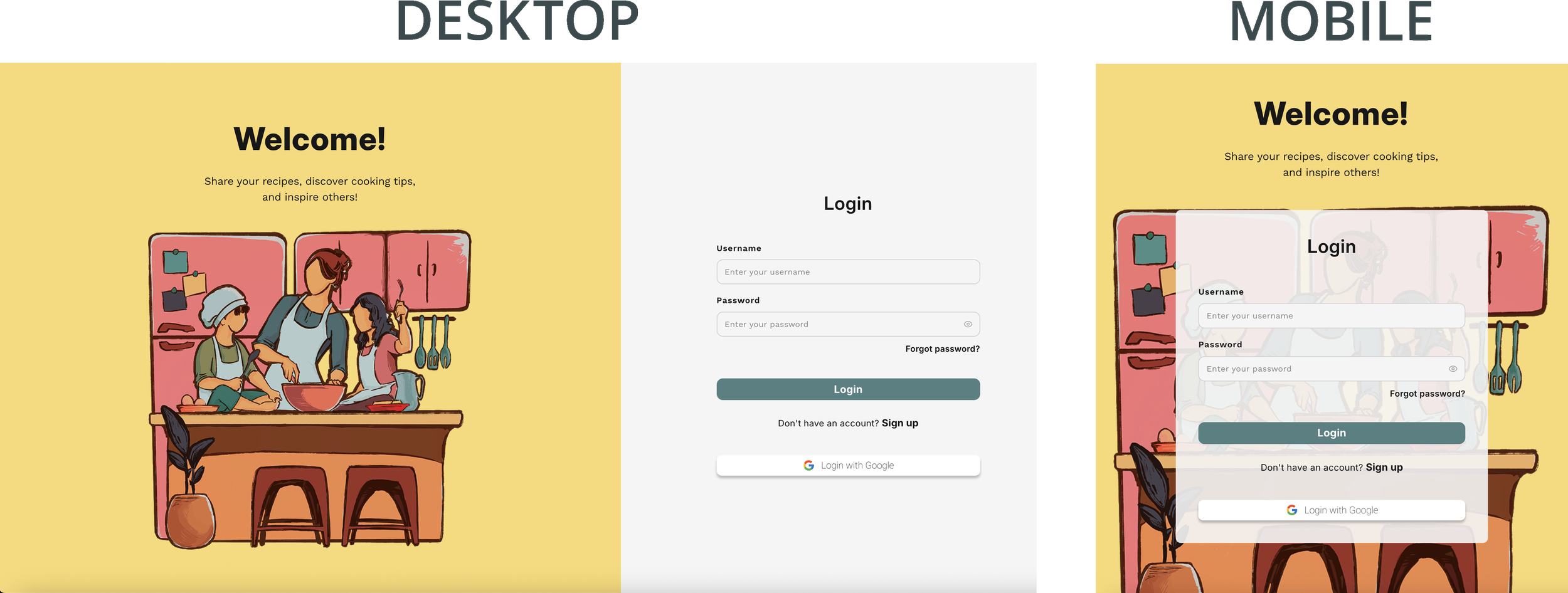
Side-by-side comparison of the Desktop and Mobile breakpoints for the landing page.
Overview
Mise en Plate is a recipe organization platform built to help users save, filter, and share recipes in a clear, accessible format. It focuses on recipe discovery and organization for users with specific dietary needs, without borrowing the social-network conventions of friend feeds or Facebook-style connections.
The goal was a usable recipe hub: a place to keep favorite recipes, browse by dietary restriction or cuisine, and manage submitted and saved recipes through a simple account experience.
Problem
Recipe discovery gets harder once you factor in dietary restrictions, cuisine preferences, protein type, prep time, and other practical filters. Most recipe platforms are either content-heavy, socially driven, or inconsistent about how they categorize recipes.
Mise en Plate started from a simpler question:
How might we help users find and organize recipes the way they actually plan meals?
A secondary challenge was trust. Because tags are user-submitted, dietary labels like gluten-free, vegetarian, or dairy-free depend on accurate tagging and moderation. A recipe labeled gluten-free could still list soy sauce as an ingredient unless a user or moderator catches it. The current version doesn't include a full flagging system, but the UI architecture supports future reporting through a nested modal pattern.
Audience
The primary audience is users who want easier recipe filtering and organization, particularly those with dietary restrictions or strong preferences around ingredients, cuisine, or protein type.
It's also built for users who collect recipes from across the web and want one place to save, revisit, and organize them. A future extension would let users pin recipes from external sites, turning Mise en Plate into a more general recipe collection tool rather than just a repository for original submissions.
My Role
I led branding, UX flows, prototyping, and frontend implementation, taking the product from early wireframes to a responsive, working interface. My work shaped the visual identity, interaction patterns, and responsive layout system, with a focus on making the product feel organized, usable, and consistent across screen sizes.
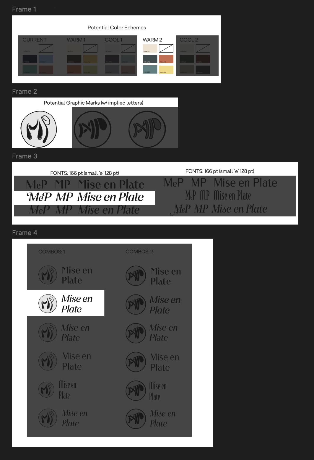
Early brand exploration included palette testing, typography studies, and logo directions that combined food imagery with the initials “MeP.”
Key responsibilities included:
Developing the visual identity, including logo direction, color palette, and typography
Designing user flows and interface layouts in Figma
Implementing frontend screens in React, HTML, and CSS
Collaborating with a backend-focused partner on route structure, account flows, and protected pages
Designing responsive layouts for desktop and mobile
Backend decisions were shared with my project partner; my focus was making the interface usable, organized, and visually cohesive.
Product Structure
The product has both public and protected routes.
Public routes cover login, sign up, forgot password, and reset password. These are intentionally separated from the authenticated product experience, reached only by direct visit or email link.
Protected routes cover the main recipe experience, user profile, saved recipes, submitted recipes, notifications, recipe creation, and search.
Splitting the routes this way keeps onboarding and account recovery out of the way of the main recipe organization experience.
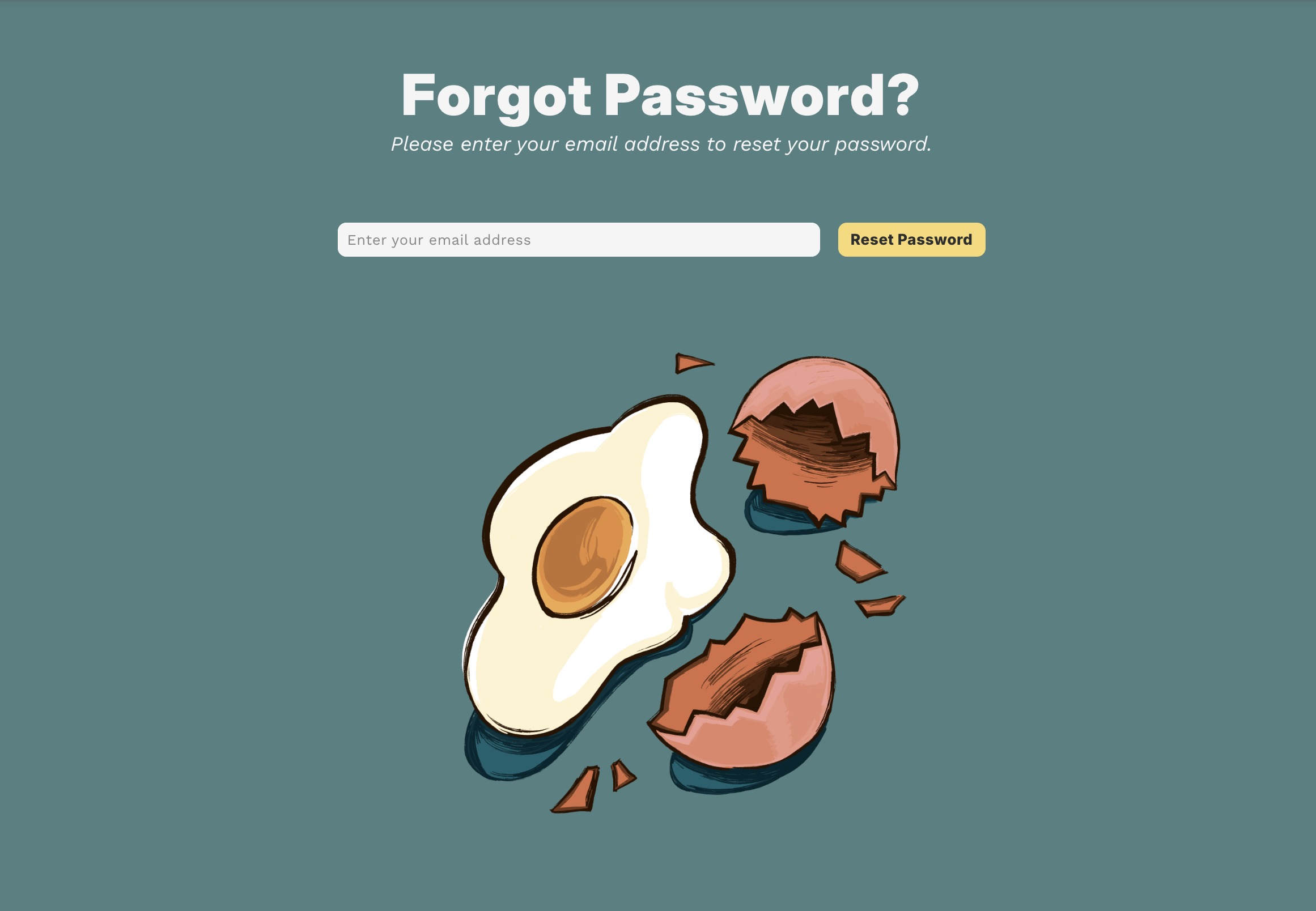
Public account-recovery routes were designed separately from the authenticated recipe experience, keeping login and password-reset flows outside the main product navigation.
Key Design Decisions
Dietary restriction shortcuts
The front page surfaces icons for common dietary restrictions that drop users directly into advanced search, filterable by dietary need, cuisine type, protein, and other tags. The goal was to make the product feel immediately useful rather than opening on a blank search bar.
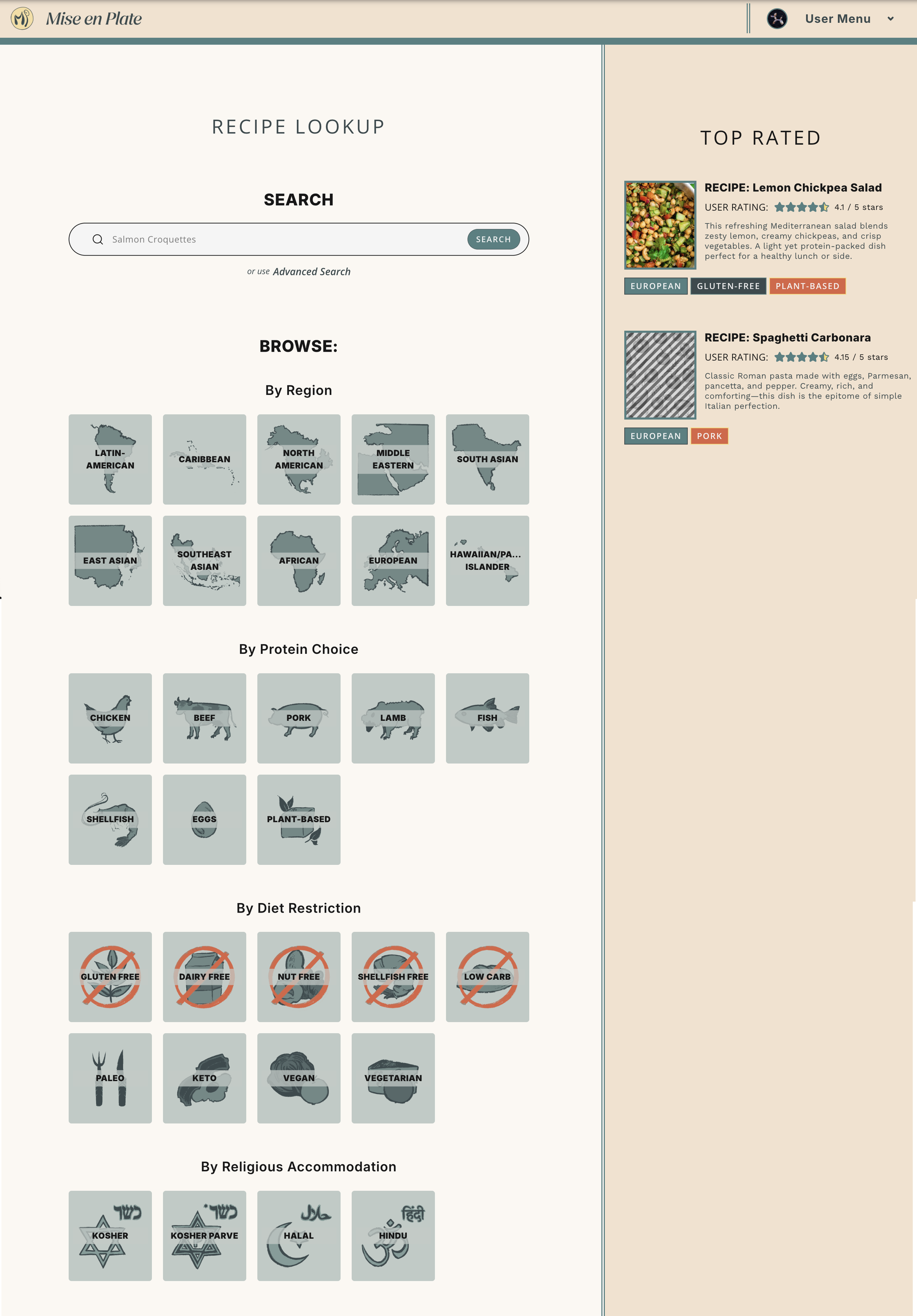
The home page gives users multiple entry points into the recipe database: direct search, category-based browsing, and top-rated recipes.
Flexible tagging system
Recipes support multiple tags. A jerk chicken recipe, for instance, can be tagged "chicken" as a protein and "Caribbean" as a cuisine. This lets one recipe surface in multiple relevant contexts depending on how someone searches, instead of forcing it into a single category.
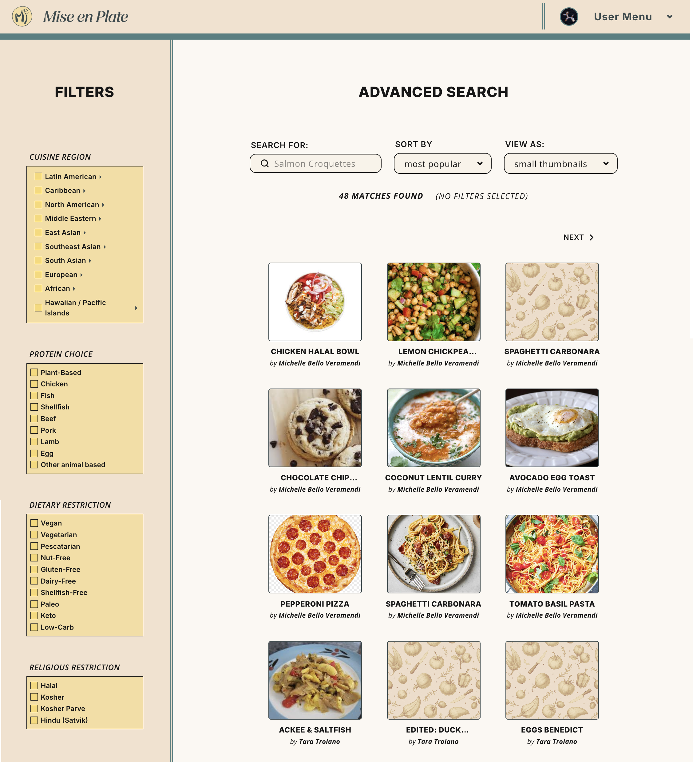
Advanced search supports flexible filtering across cuisine, protein, dietary restrictions, and religious accommodations, allowing one recipe to appear in multiple relevant contexts.
Recipe page structure
The recipe detail page follows familiar conventions rather than reinventing the format: images, prep time, cook time, ingredients, instructions. I deliberately tested some lower-quality, user-style images in the layout, since user-generated recipe platforms rarely have consistently polished photography. The design needed to hold up even when the content didn't.
Create recipe page
The create recipe page is built to feel like a recipe card rather than a generic form. On desktop, information splits across two sides for a more structured, scannable layout. On mobile, it collapses into a single column, with image display and form content re-adjusted rather than simply scaled down from desktop.
User profile and recipe management
The user page combines account information, preferences, saved recipes, and submitted recipes into one view. User info and recipe management were originally separate pages, but the info page alone didn't carry enough content to justify its own screen, so the two were merged. The result is a shorter profile/preferences column alongside a larger recipe card area for saved and submitted recipes, and one less navigation step to get there.
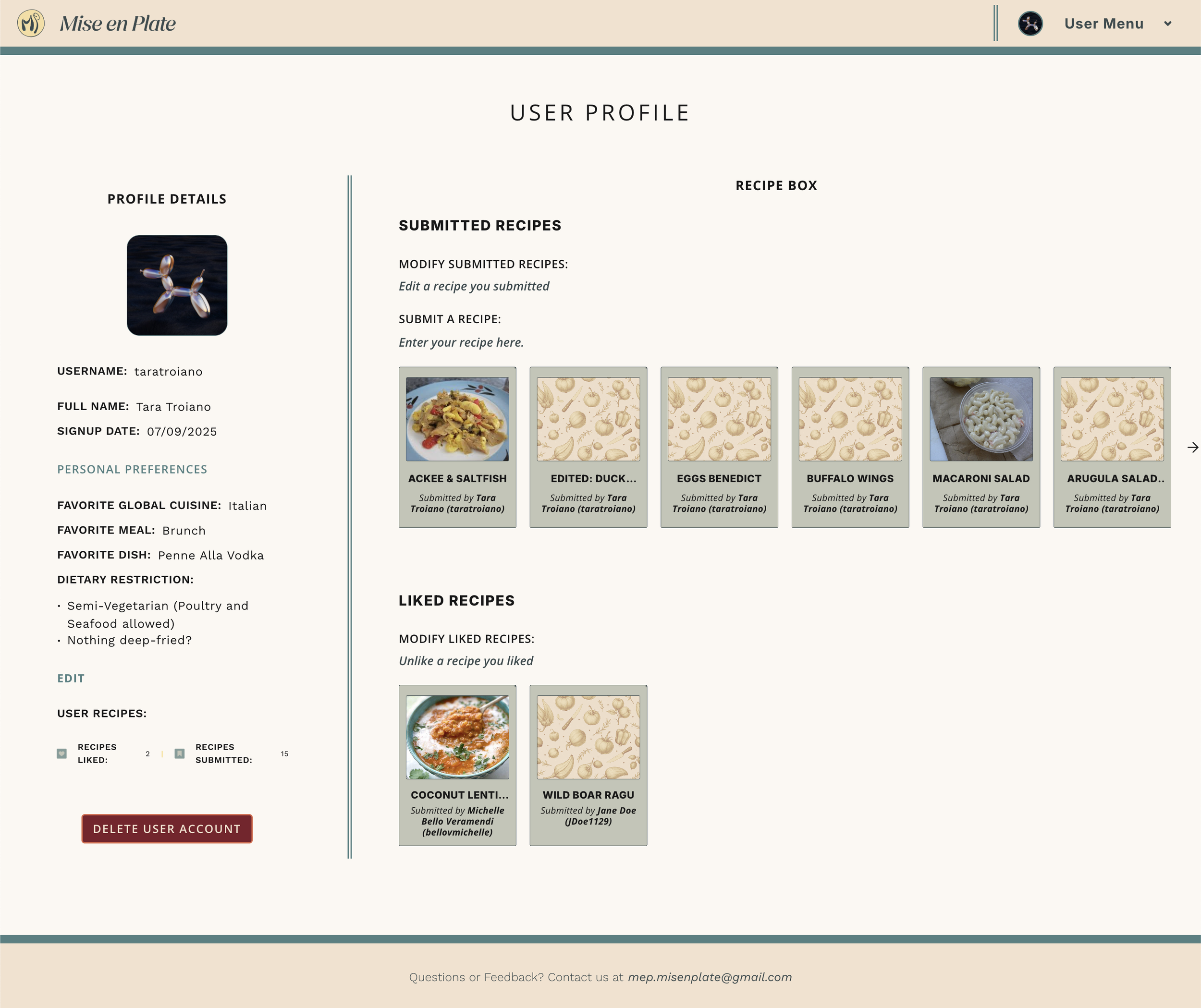
The profile page combines account details, preferences, submitted recipes, and liked recipes into one account hub.
The user page combines account information, preferences, saved recipes, and submitted recipes into one view. User info and recipe management were originally separate pages, but the info page alone didn't carry enough content to justify its own screen, so the two were merged. The result is a shorter profile/preferences column alongside a larger recipe card area for saved and submitted recipes, and one less navigation step to get there.
Notifications
The notification system was simplified from a detailed open-and-read model to a lighter indicator that directs users to the notifications page. This kept the interaction scoped appropriately for the project while still surfacing new account activity.
Responsive Design
Desktop pages lean on two-column structures to make dense information easier to scan. On mobile, those collapse into single-column flows, with images, forms, and card-based content re-adjusted for smaller screens. The aim wasn't just fitting the interface onto a smaller screen, but preserving the hierarchy of information as the layout changed.
Constraints and Tradeoffs
As a self-directed collaborative build, some features were reduced or deferred to keep scope manageable. I prioritized the flows that made the product usable end to end: recipe discovery, account access, saved recipes, and submitted recipes, treating more complex moderation and validation features as future iterations
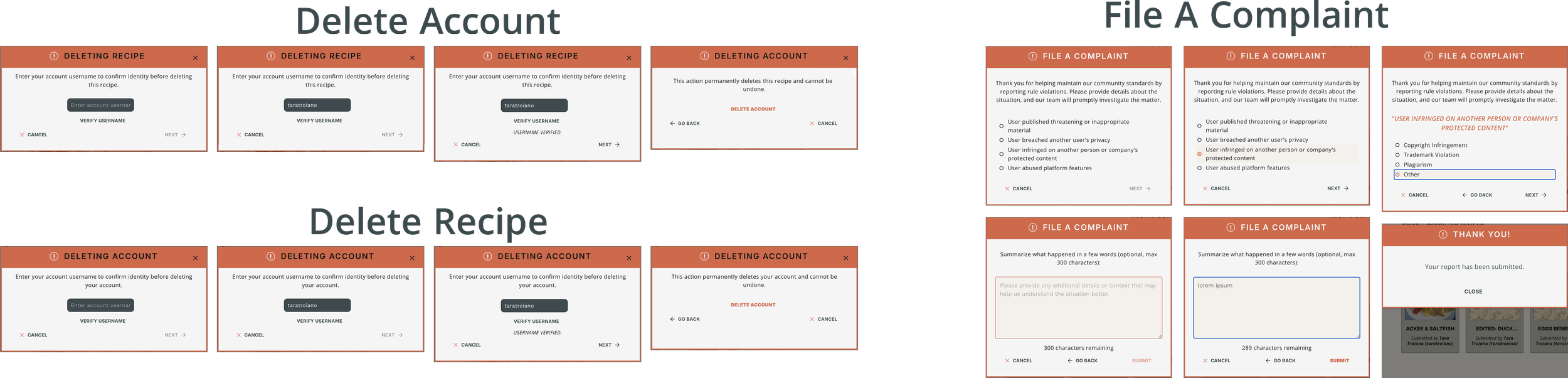
Although full moderation was deferred, the interface explored destructive-action confirmation and reporting flows that could support future trust and safety features.
A full moderation and flagging system wasn't implemented, though the UI structure anticipates it. External recipe pinning was scoped out as a future feature rather than part of the initial build. Some metadata decisions, like how recipe time should be displayed, were also shaped by project constraints and collaboration; I'd revisit whether prep time, cook time, and total time should all appear together for faster recipe evaluation.
Future Improvements
These were issues I wasn't able to fully address when designing the application, largely due to time constraints and the scope of the project.
Add a flag/report system for incorrect dietary labels or inappropriate content
Improve trust signals around dietary restrictions
Test whether users prefer recipe-first browsing or filter-first search
Add external recipe pinning from other websites
Reconsider total time and other quick-scan metadata on recipe pages
Expand empty states, error states, and onboarding guidance
Test the advanced search flow with users who have real dietary restrictions
The most significant of these, to me, is trust around dietary restrictions. Right now the system runs largely on the honor system: a user tags a recipe as gluten-free, and that tag is taken at face value. A more robust approach would flag ingredients at the point of recipe creation rather than after the fact, so soy sauce, pasta, or bread automatically triggers a warning against a "gluten-free" tag instead of relying on another user to catch the mismatch later. That shifts trust-building from reactive moderation to something closer to built-in validation.
Reflection
Mise en Plate pushed my design thinking past visual styling into information architecture, account flows, responsive layouts, search behavior, and user trust. The hardest problem wasn't any single screen, it was keeping a flexible tagging and filtering system simple enough that a user could understand it in the first ten seconds, rather than needing to learn how the product organizes recipes before they can use it.
That tradeoff, flexibility for the system versus immediacy for the user, shows up throughout the project: in the dietary shortcuts that skip straight to advanced search, in the merged profile/recipe page, in the decision to defer moderation rather than ship a half-built version of it. Instead of designing a social recipe network, I focused on a practical tool for saving, filtering, and managing recipes, and tried to make sure every added feature earned its place against that goal.